 Currently in interior design, After years of "reign" of flats almost completely white, darker colors are preferred. A large house would be an ideal, divided into zones – light and dark, with rooms with different color moods. This is not possible to implement in standard apartments in multi -family housing. The principle of the golden mean remains, that is, the use of light colors on large planes and dark as small color accents. First of all, it refers to the relationship of the wall, ceiling – furniture, details, But you can also use dark and light colors in a less conventional way.
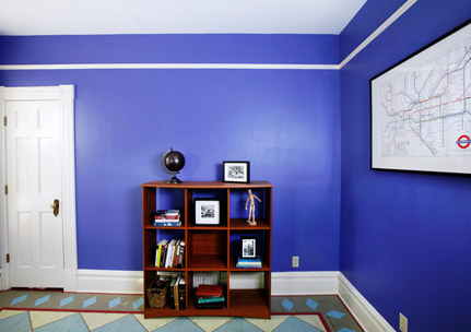
Good effects in the interior are obtained emphasizing the colors of one of the four walls of the room "full" color (np. dark brown, green, grenade), which is an excellent background for the exhibition of works of art and other home collections. Similarly, you can use vibrant colors, Saturated, separate the dining corner from the kitchen, in the living room – leisure etc.. The principle of contrasting of light and dark colors is also used in rooms kept in saturated tone. Clear color accents should be used there – drapes, Furniture etc..
When choosing a set of colors, the principle of cooler colors also applies, from the Blue range, greenery, gray in rooms with high sunlight, open south and warm colors, from the bile family, red, brown in northern rooms. And finally, the darkest color is used on the floor to "embed" the room in space, brightest on the ceiling, and all intermediate tones behave for walls and details, furniture and fabrics.
Of course, these are not rigid rules; All other ideas may be equally good. However, the contrasting interior should not be transferred to the residential interior, lively, shocking color solutions observed in the theater, cafes, nightclubs etc.. You must not forget about it, that you stay in the home climate of colors for most days of the year – Hence the suggestion to choose subdued colors, because these are more pleasant to the eye.